DESIGN BLOG
Another Modern Take on the American Farmhouse
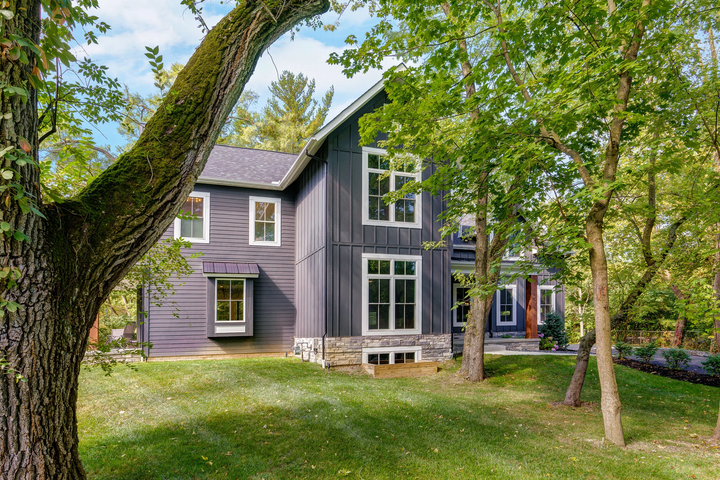
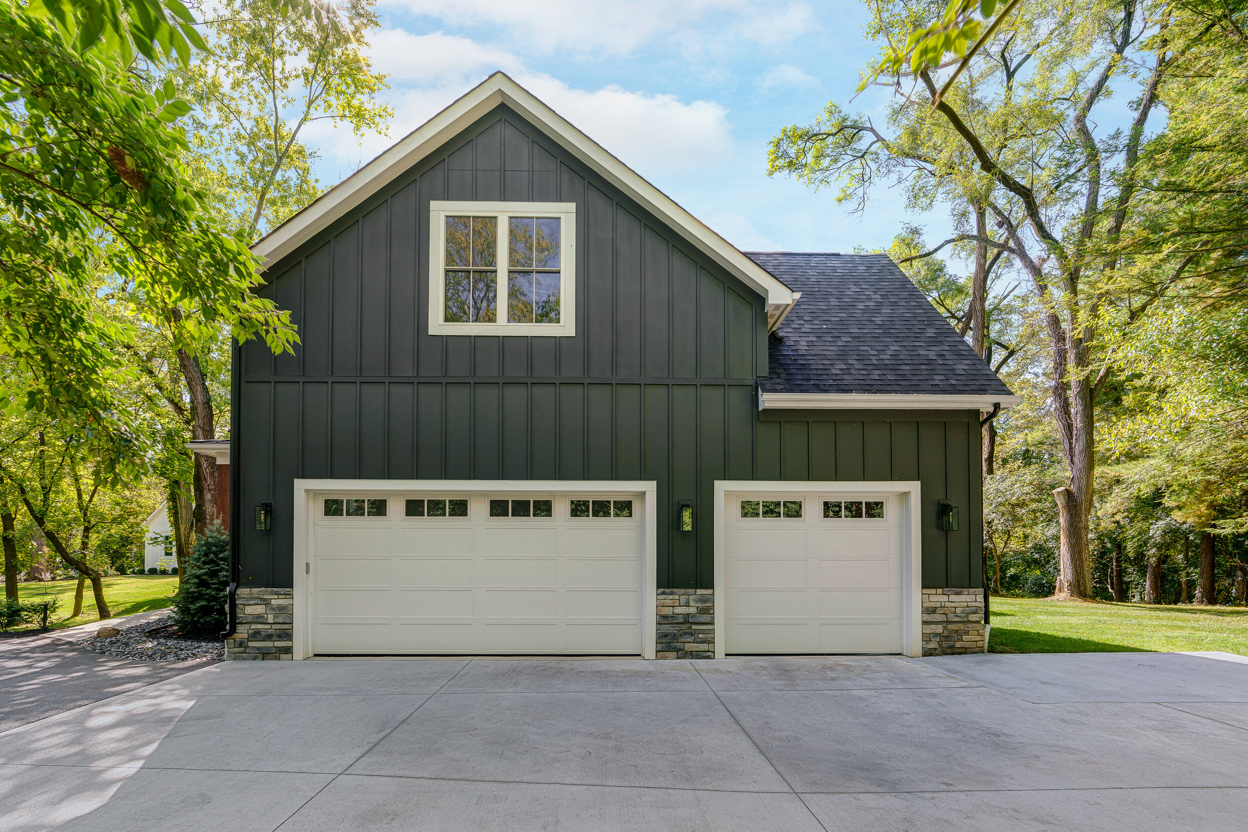
This modern farmhouse, found nestled in the back of a long, wooded lot in Worthington, Ohio, showcases mixed materials on the exterior adding to the modern look of the home. The dark board and batten mixed with standard wood siding in the same color add visual texture to the home, while the stone water table and natural wood accents add warmth to the overall exterior aesthetic.
Another Modern Take on the American Farmhouse
One of the things that keeps the farmhouse at the forefront of the style game is its ability to change and evolve. The modern farmhouse style includes more modern design elements than ever and the design team here at RDS has wholeheartedly embraced these details when designing homes for our clients.
While white is the predominant color for the exterior with black accents, you’ll also find the palette reversed, like in the home we’ve featured here. The dark exterior with white trim provides an edgier take on the clean and contemporary look of modern farmhouse.
This modern farmhouse, found nestled in the back of a long, wooded lot in Worthington, Ohio, showcases mixed materials on the exterior adding to the modern look of the home. The dark board and batten mixed with standard wood siding in the same color add visual texture to the home, while the stone water table and natural wood accents add warmth to the overall exterior aesthetic.
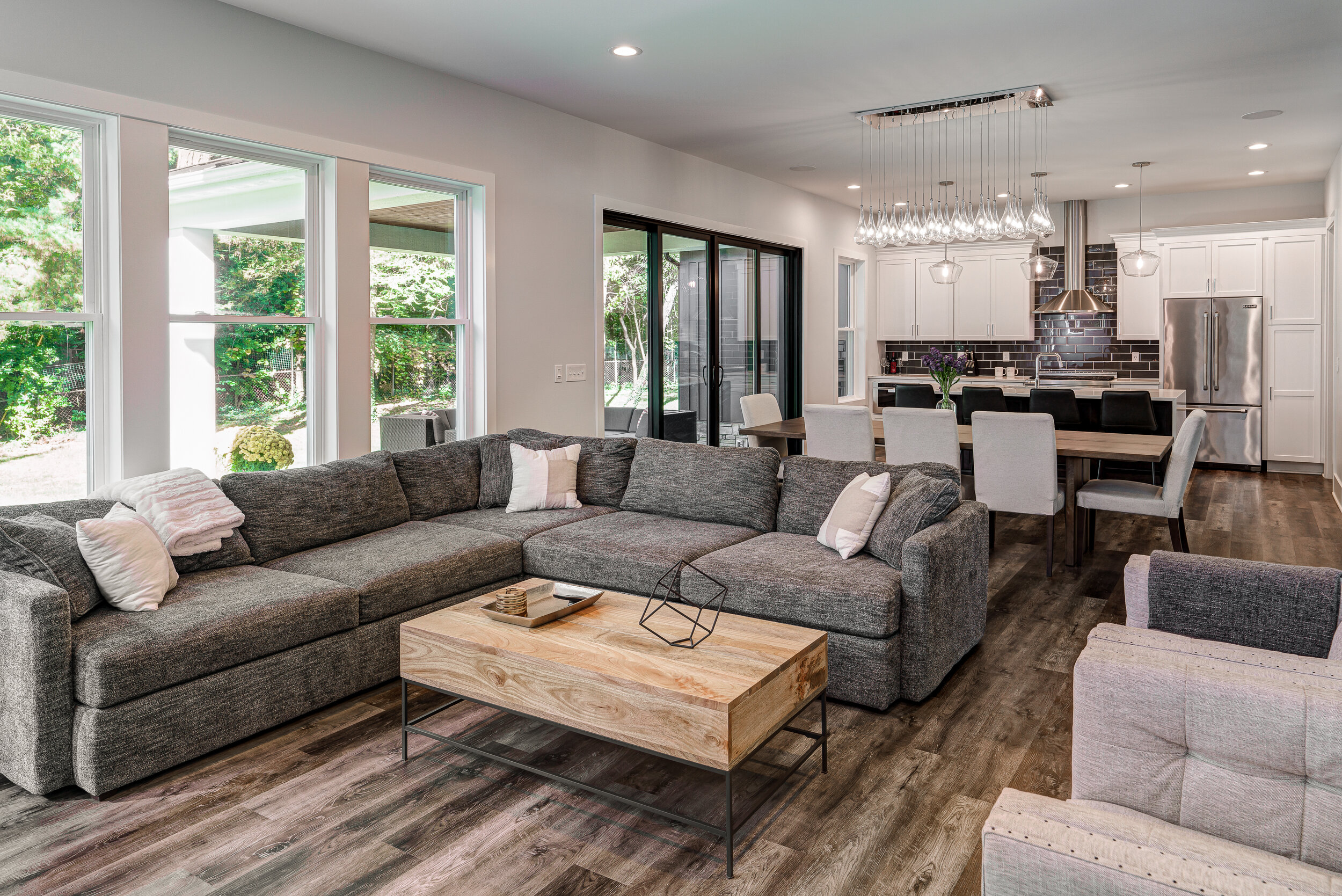
Another characteristic synonymous with the modern farmhouse style is the use of unique features. Some distinctive features found in this home include the carefully curated lighting fixtures, textured walls (brick in the laundry room, glass tile in the kitchen), and the industrial metal touches (stair railing, metal kitchen sink, range hood) throughout. The elements add to the visual interest of all the spaces in the home.
The careful placement of the windows invites lots of natural light into the home and allows the homeowners to feel connected to the outdoors while maintaining their privacy.
We can describe each room and space in detail but would rather leave you to enjoy all the photos and experience the home for yourself.
If you’re considering building a new home or remodeling your current one, we’d love to talk with you about your dream home and be part of your team. Reach out today to start the conversation.
Builder: Sierra Custom Homes
Photography: ARC Photography
1970's Contemporary Transformed
Small project turned giant undertaking: a remodel of our client's entire house! Stripped down to the footers, this cold, 1970's contemporary was built up into a warm and welcoming craftsman home.
Sometimes what a client thinks they want doesn’t become what they envisioned—it becomes so such more! Our clients were imagining an updated and opened up sunroom on the back of their home. But this cold, 1970’s contemporary home took on a life of its own and turned into a giant undertaking: a remodel of the ENTIRE house. What started as a conversation about the sunroom became a series of “What if?” questions and we were happy to oblige. The house was taken down to the footers and built back up into a warm and welcoming craftsman home.
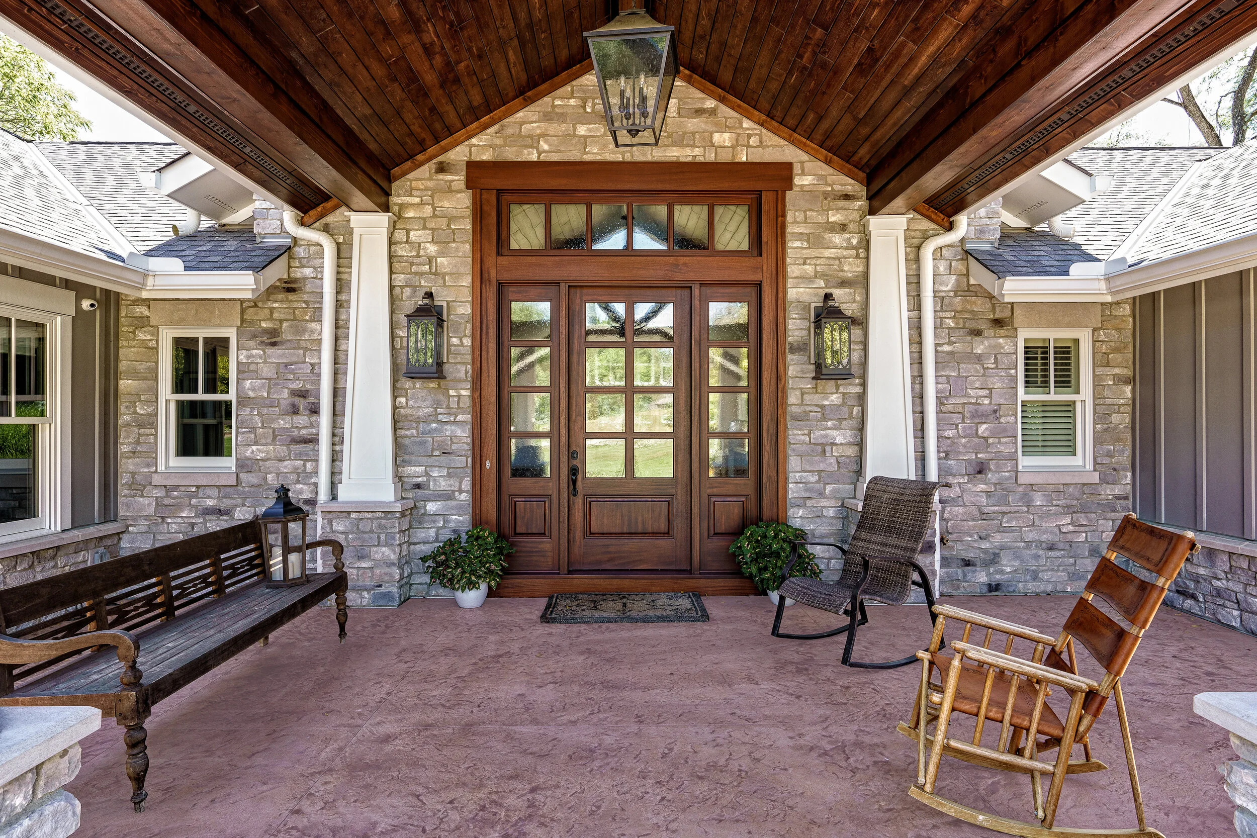
Our clients wanted an entry porch with open beam work, similar to something we’d created for a neighboring home. But because of the u-shape of their home, there wasn’t a way to capture the look they were after without floating the porch between the guest wing and garage like the option that was ultimately chosen.
Some of the most used spaces in the home went from being separate rooms to utilizing open plan living, with each room delineated with furniture and decor, and the spaces all open to one another.
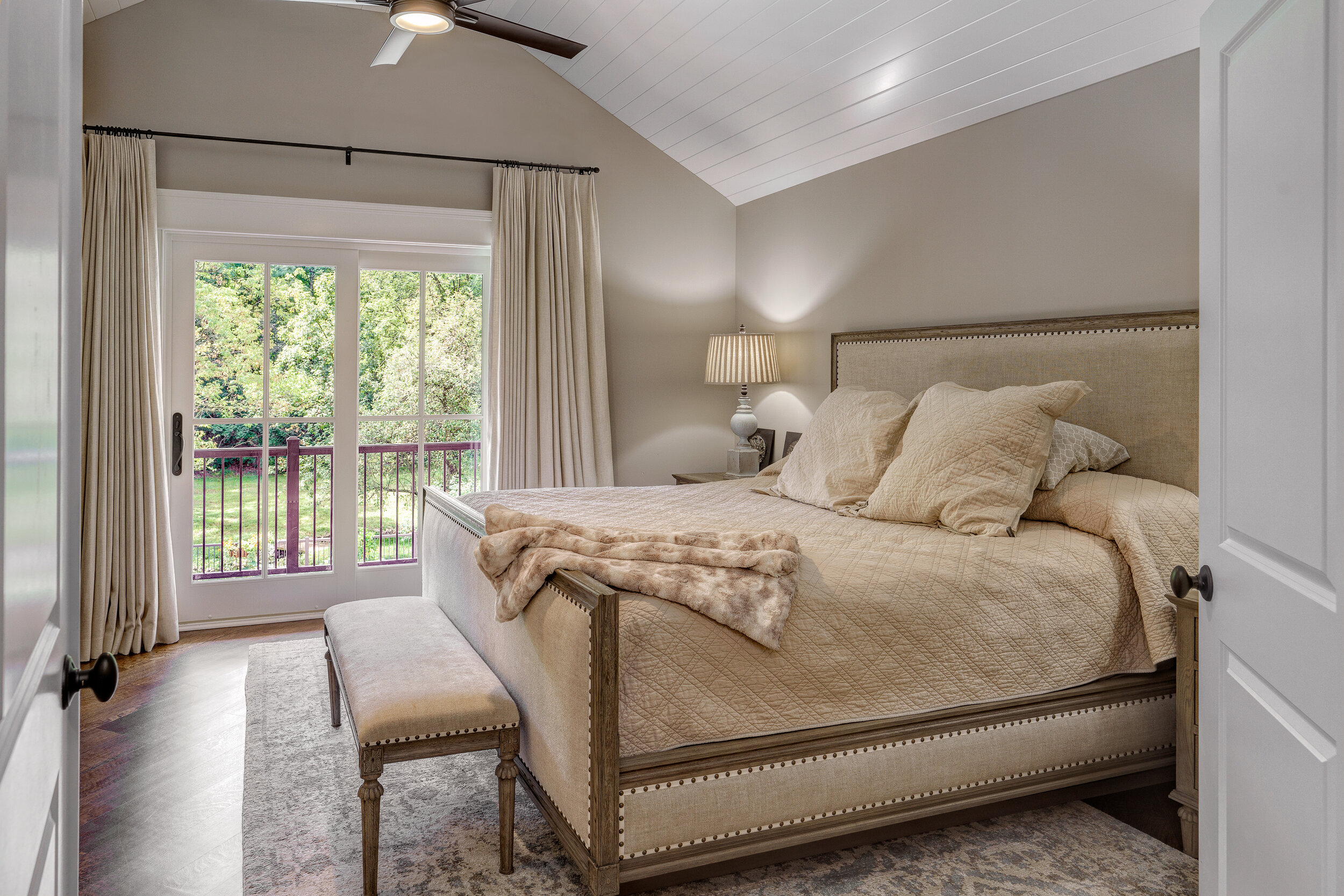
The footprint of the owner’s suite didn’t really change, but the details and finishes were updated and amped up to help create a peaceful, cozy feel.
We can describe each room and space in detail but would rather leave you to enjoy all the photos and experience the home for yourself.
If you’re considering building a new home or remodeling your current one, we’d love to be part of your team. We love to have these “what if?” conversations and create more than you had even contemplated. Please reach out today to get the process started.
Builder: Timbercrest Custom Homes
Interior Design: Cynthia Trucco Interiors
Photography: ARC Photography
